Here at Momentum Advisory, we’ve been working on many projects lately which have seen us heavily invested in brand development. If you are a business owner or B2B Marketer, you likely understand the significance of your brand. We should remember that our brand is more than our tagline or imagery. It’s also much bigger than the colours, shapes and font we choose. Consumer brands have branding down to an exact science and there is much we can learn from them. But, here in B2B land, we’re still playing catch up.
Whether you are launching a new business or looking to do a brand refresh, it can be sometimes confusing knowing what to do and when. While marketing is about competing for human attention, branding is about connecting with people. People connect with brands that show us over and over again that they fulfil more than a basic need, they meet an emotional need, connecting with the heart and the mind. Your brand is a promise. Unless you are proficient in the area of brand building, we’d suggest that you incite the help of some specialists when trying to figure out the brand promise. There are layers to brands that need to be unravelled before we can get to the heart of the promise.
Great brands are born out of businesses taking the time to really understand their customers, their needs, the value they offer them over and above the competition, and the functional and emotional benefits they offer. Some of our clients have been evolving and revolutionising their existing brands, and in some cases creating new ones. We’ve really enjoyed all of this work and love the sense of anticipation when we are about to see a new or evolved logo for the first time. So, without going too much into the science of branding, we’ve jotted down some pointers which might help you to evaluate whether or not your brand identity is portraying the message or promise that you wish to communicate with your customers.

The first visual touchpoint a brand typically has, is the logo. The logo is the signature of a business and at the heart of any company branding. The purpose of a logo is to represent the company visually, influence the perception customers have of a business and identify the personality of the brand. As different as logos may look in style, they all include five key elements:
- Personality
Brand personality is a set of human characteristics attributed to a brand; having clarity on this will make your brand easier to be remembered and identified as it increases the chances of connection with your audience. This will also directly affect the other elements of your logo – as they will need to represent these selected traits. One of the ways to define it is by asking yourself, if your brand was a person, how would you describe it? Is it modern or rustic? Is it masculine, feminine or (so 2019), gender neutral? Is it fun or traditional? Is it youthful or mature? To answer these questions, you need to consider a range of aspects in the business; start with the product or service you offer. For example, Children’s Toy brands would be fun and youthful, whereas a law firm would be more traditional and serious. Consider your target market; your values and the market you are trading in.
- Colours
The colour scheme often has more meaning than simple visual appeal. Have you heard of the psychology of colours? This is how our brain perceives colours, which affects our behaviour and influences our judgment. There’s a good read on colours in branding here. When designing company branding, especially the logo itself, think of what feelings you would like to evoke. For example, the colour red is often used to represent energy, passion as well as action. In contrast, colours such as green and blue are tamer and more peaceful. Colours such as black and white are the underlining colours in logo creation and are often the pillars for a successful design, both embodying sophistication and strength. Other than the psychology behind colours, it’s also worth thinking of the contrast and design background when selecting your colour scheme as this layout will ensure your branding works in any situation without losing its integrity. It’s also worth thinking of the channels you communicate your brand via, will that scheme work as well online as it will in print? Don’t overcomplicate with textures, keep it clean, and, too many colours is a no-no!
| Red | Orange | Yellow | Green | Blue |
| Power Excitement Passion Energy | Confidence Warmth Energy Bravery | Optimism Warmth Creativity Happiness | Health Hope Nature Growth | Trust Loyalty Logic Security |
| Purple | Pink | Brown | Black | White |
| Wisdom Luxury Royalty Spirituality | Imaginative Passionate Creativity Balance | Serious Earthiness Support Authenticity | Sophistication Security Power Authority | Clean Clarity Simplicity Fresh |
- Fonts
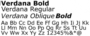
The importance of text and fonts within a logo design is also not to be forgotten. The font itself has its own identity and will help portrait your brand personality. For example, Times New Roman is a more traditional font, while Verdana is a more modern style.


Serif font, more conservative Sans-serif font, more contempory
When using text or taglines within your design, it’s important to keep the copy short and sweet as overpopulating the logo could mean it will not capture the attention in the same way a short snappy use of text would.
- Shapes
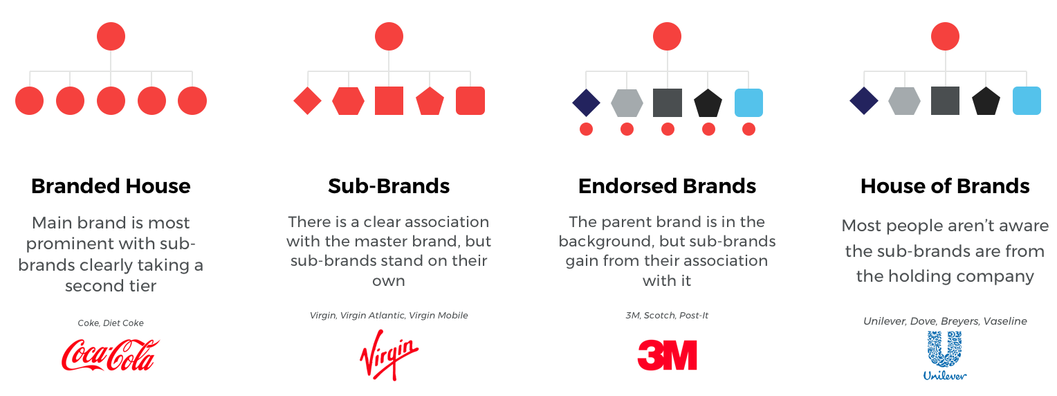
Shapes and geometrical structures are often included in logo designs throughout the business spectrum. They are used as icons and in some instances, or over time, are enough to identify the brand without the company name. Shapes and images within logos should have a specific reason and carry a meaning that is at the forefront of the brands operations. A great example of shape usage in the business environment is the world-renowned Nike ‘Swoosh’, this shape has curved edges with points at opposite ends to symbolising sharp movement – perfectly representing the nature of Nike as a business. When building brands, it’s important to consider them in the context of the overall business. Ultimately, how should your family of brands be represented? The image below depicts four such ways that some of the consumer giants have built their brand portfolios:

Now that you know the main focus points to consider when creating or evolving a logo, you’re ready to evaluate how well your current brand identity is serving you. If there’s misalignment between your identity and the message you wish to communicate, it might be time to take action. We’re here to help, should you need us!
